At Doist, one of our priorities is empowering our users with choice. Both Todoist and Twist are available across Windows, macOS, Android, iOS, and the web. Providing platform flexibility and the ability to use our tools across multiple devices is something we’re proud of.
However, offering our apps on multiple platforms naturally results in some inevitable design debt. It can also mean inadvertent disparities between apps from platform to platform – for instance, the Todoist web app might use slightly different copy than the Todoist Android app. This is especially the case with a product like Todoist that’s almost 12 years old.
A few examples of small “platform parity” issues we run into include:
- Inconsistent copy
- Incorrect color for body text
- Dissimilar icons
- Different corner radiuses
- Missing warning modals
- Discrepancies with emoji rendering
These issues may seem small, but without special attention, tiny product disparities add up and become extremely apparent over time. Over the past two years, we've honed a collaborative workflow between designers and developers that allows us to pay back that design debt on an ongoing basis alongside our bigger projects. This article will walk you through exactly how we implement that workflow using our team task management tool, Todoist, and our team communication app, Twist.
Experimenting With a New Workflow
Workflows are simple when a team is small. As our team grew, we introduced complexity into the system. For instance, our developers and designers were working in silos, sometimes unaware of what the other team was working on. It wasn't clear when a fix was live or available to test. We also used too many tools, leaving us with no idea where to look for the most recent information.
[app_quote_featured]We resolved to improve our design and development workflow after recognizing there was a real need to report and fix smaller issues in a more organized and transparent way.[/app_quote_featured]
We had several objectives while creating a new and improved design and development workflow:
- Reduce tools: We set out to reduce the number of tools in our process, narrowing them to only Todoist and Twist. This created an automated process of assigning tasks within larger projects in Todoist and communicating the status of that task in Twist.
- Decrease complexity: Instead of trying this new process with both our products, we started with our small Twist team where we had only one developer per platform. It would be much easier to test this workflow with only a few people.
- Improve transparency: Our new process had the added bonus of increased transparency - everyone inside the company is able to follow all changes in Twist.
We aimed to create a deeply connected workflow between product designers and platform developers and landed on the following process:
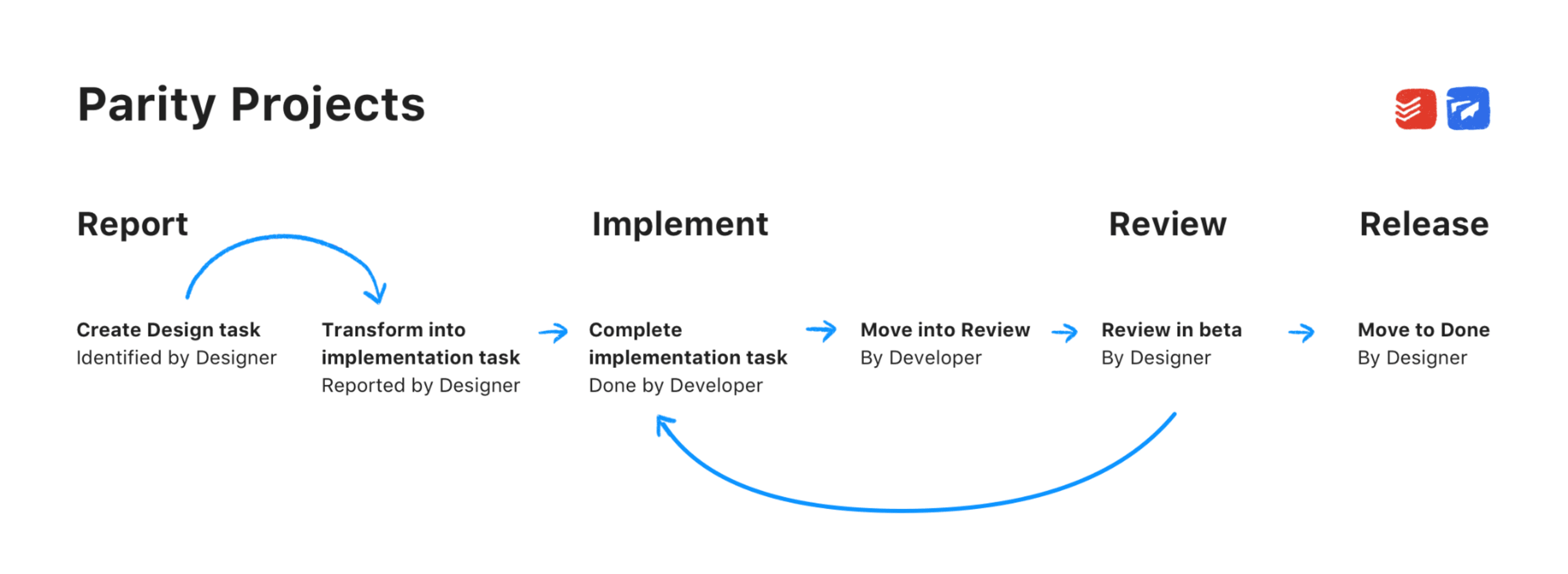
- Report: The designer is responsible for identifying parity issues within our apps. Then, they must identify a design solution and create a task for a developer to implement.
- Implement: The developer is responsible for implementing the solution, communicating to a designer that it’s complete and in beta, and requesting a review.
- Review: The designer reviews the revised feature or fix in beta.
- Release: The designer communicates that the feature of fix is resolved and can be released to users.
This process has allowed us to prioritize smaller fixes alongside bigger projects and do so in a way that allows us to move both rapidly and transparently. Here's a detailed breakdown of how we use Todoist and Twist to make sure small design fixes and improvements don't get lost in the shuffle:
Our Design and Development Workflow
Our design and development workflow can be broken down into a series of discrete steps. This process allows designers and developers at Doist to work together effectively to continuously polish our products and keep the design experience consistent across the Web, Windows, macOS, Android, and iOS apps.
- Develop a Review Timeline
- Set up a Todoist Project
- Connect to Twist
- Assemble Your Project Members
- Add Tasks to the Project
- Prioritize Tasks
- Report Implementation Tasks as Complete
- Assign Task Back to the Designer
- Move the Task to "Review"
- Review Task and Move to "Done"
Develop a Review Timeline
Achieving consistent design across products and maintaining feature parity shouldn't be a passive process. Instead, designers at Doist regularly set aside time to perform QA (quality assurance) sessions across platforms. For instance, I try to schedule a small amount of time every other morning for QA.
Timing of QA sessions should also be in accordance to release schedules – Web and Android updates are much more frequent than iOS at Doist, so this influences the frequency of reviews. Proactively searching for discrepancies – and setting time to do so on a set schedule – will help your team avoid an accumulation of parity issues that eventually becomes unwieldy design debt.
Set up a Todoist Project
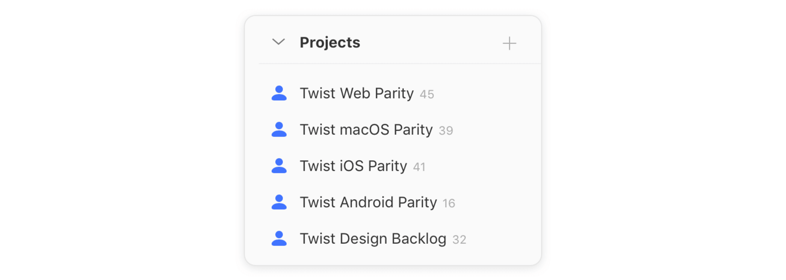
Each platform we work on for Twist (e.g. “Twist Web”, “Twist iOS”, etc.) has its own Todoist project. All QA and parity tasks that have been reported and need to be reviewed are added there.
We use the following naming scheme:
“[Product] [Platform] Parity” = Twist Web Parity
We structure each project into three specific sections:
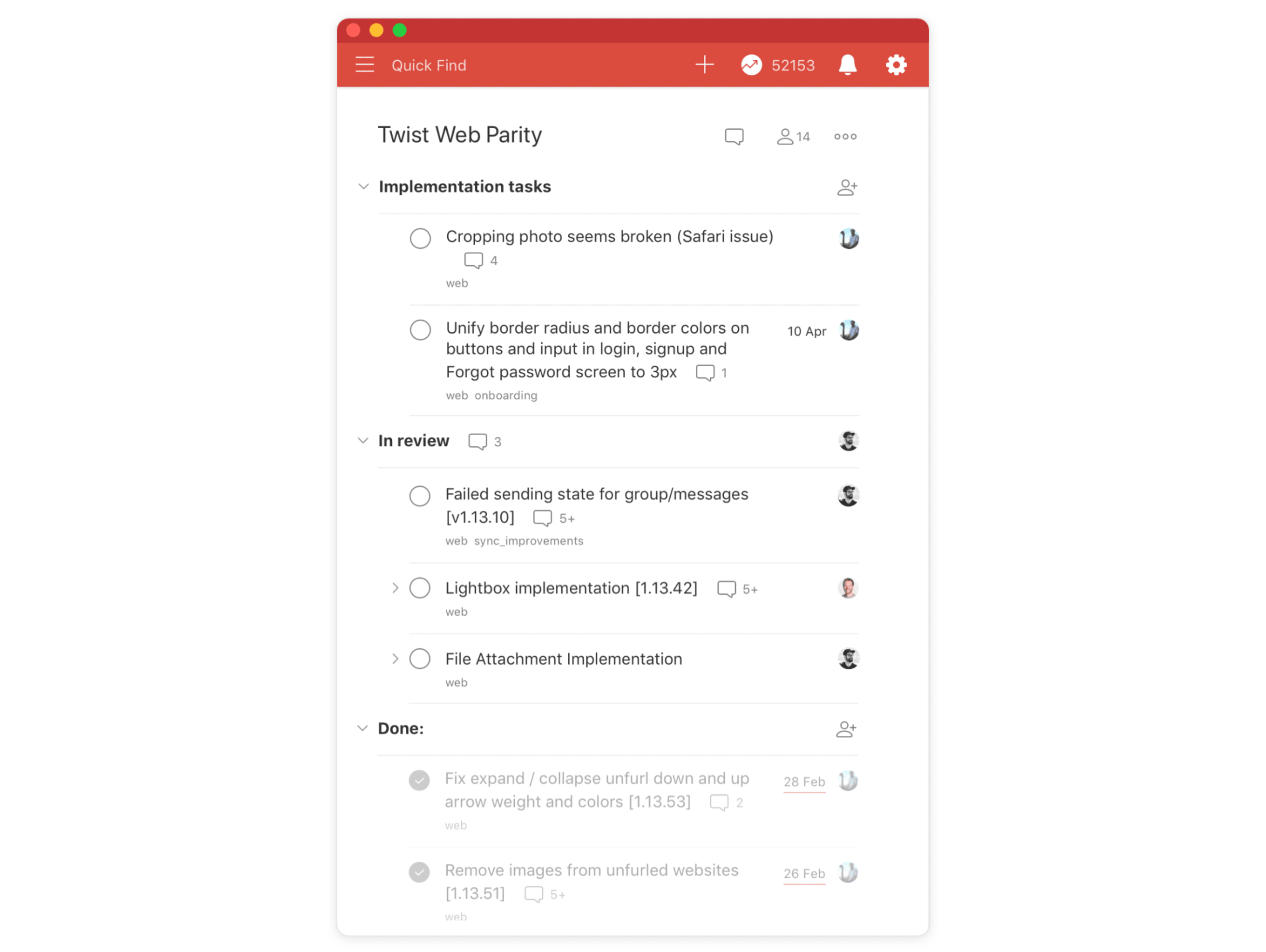
- Implementation tasks - This section contains all tasks designers have reported and assigned to developers. Internally, they’re called “parity tasks”. Parity tasks are small changes to ensure feature, functionality and visual design parity. They typically don’t include critical bugs.
- In review - This includes all the tasks that are ready to be reviewed by a designer. If a task is done, the developer completes the task, notifies the designer, and adds the information about when the change will be live in the task comments.
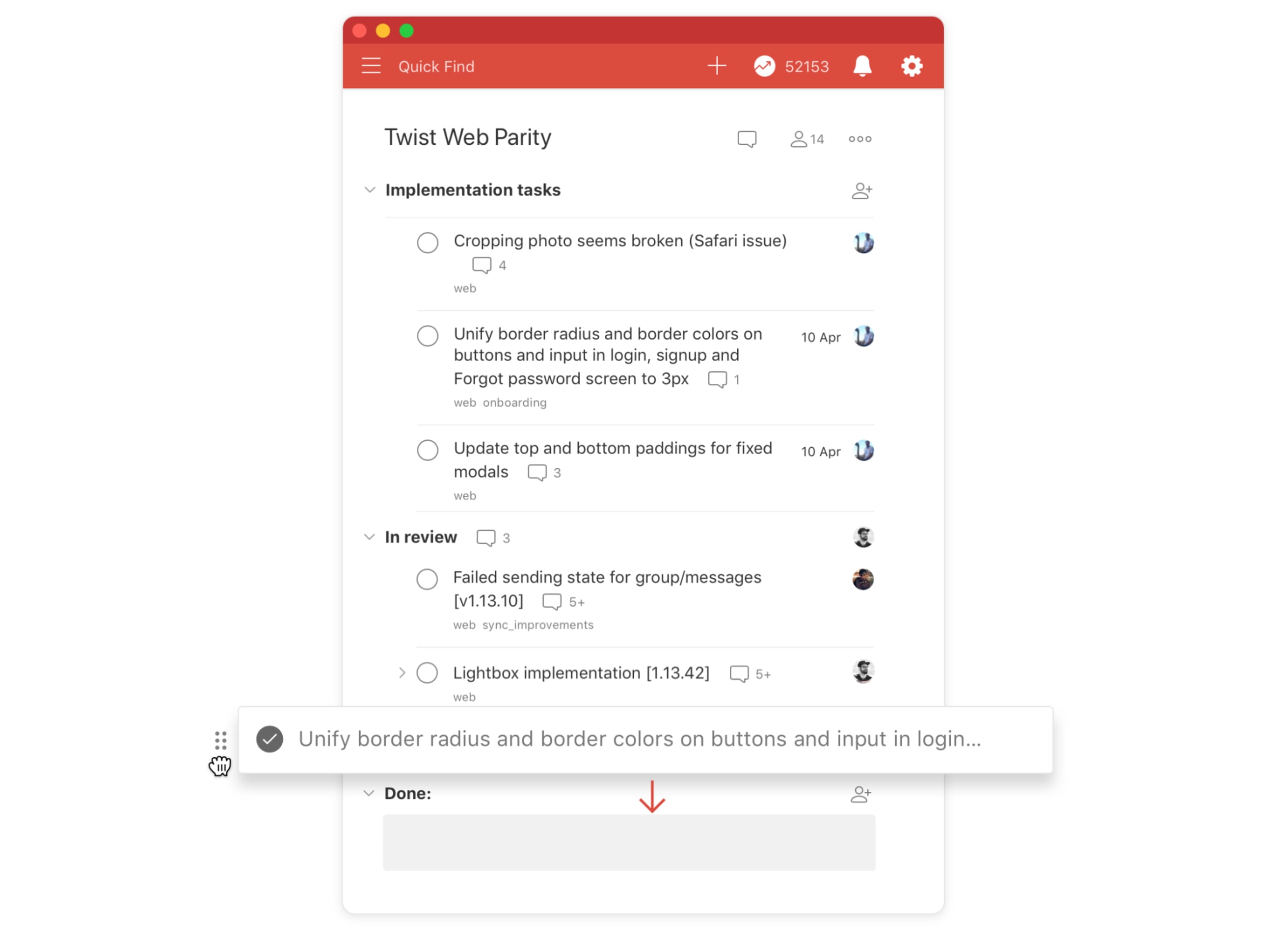
- Done - All tasks that have been reviewed and implemented get checked off and moved into this section.
Connect to Twist
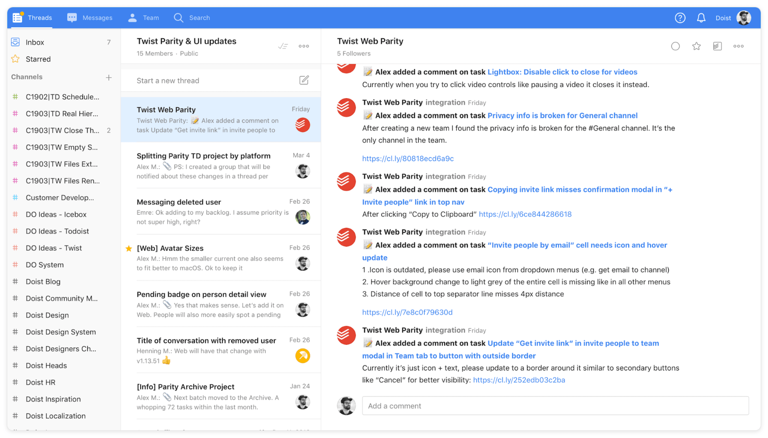
For complete transparency about any changes in the parity projects, we set up a Todoist integration in Twist. Each platform channel in Twist contains a new thread integration with comment activity from the Todoist project. Using Todoist and Twist together lets us balance action and communication.
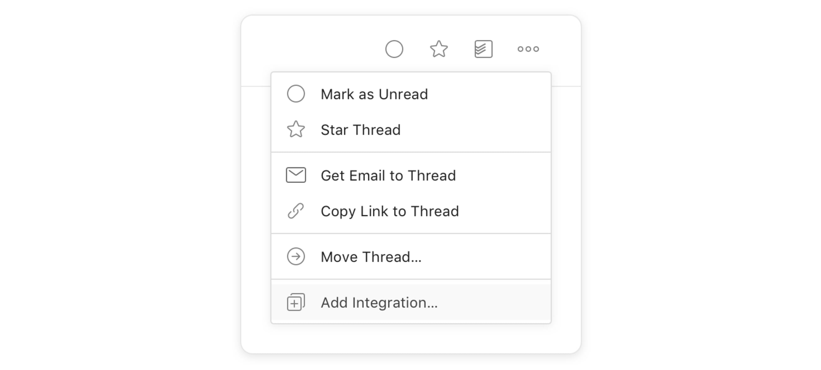
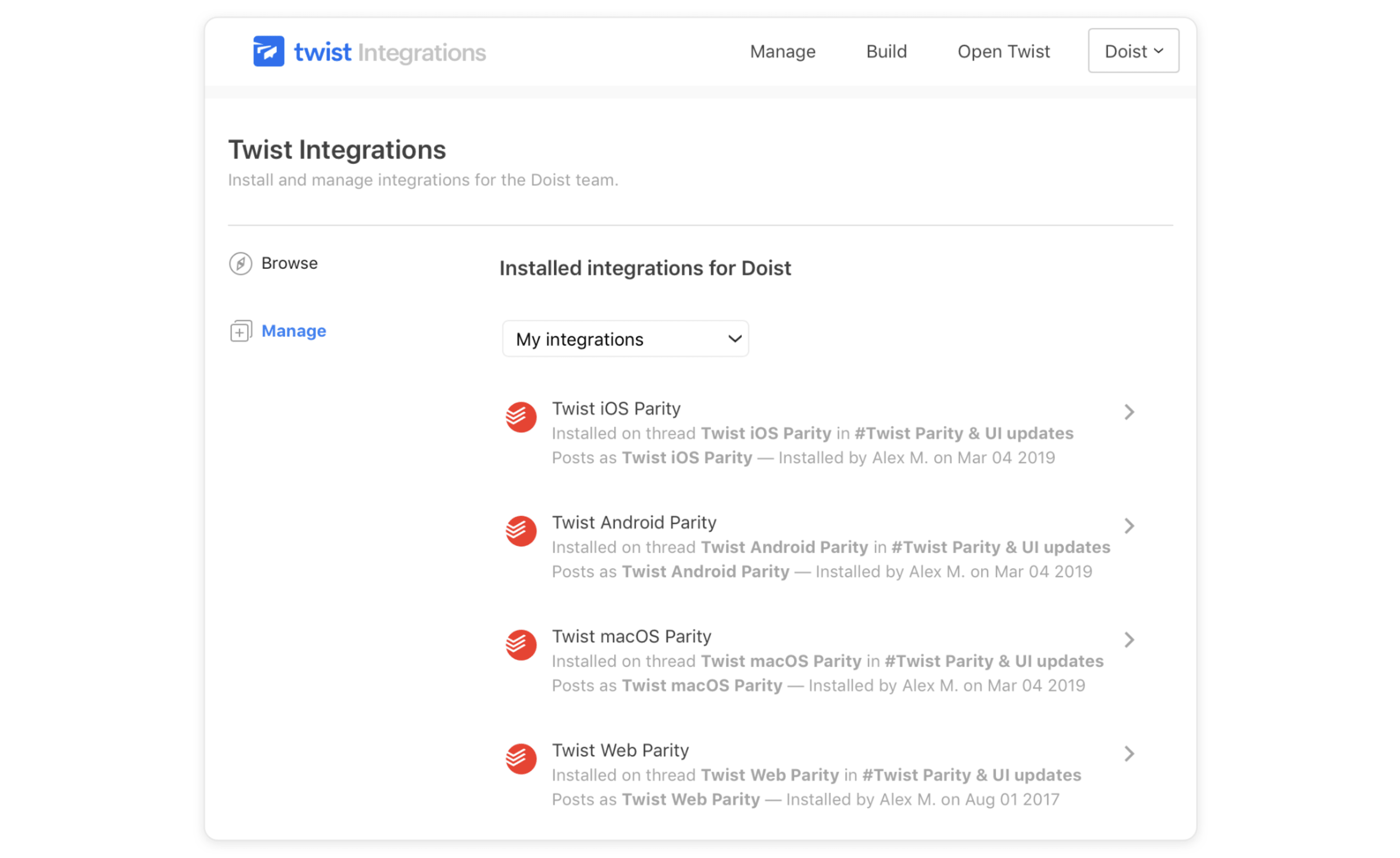
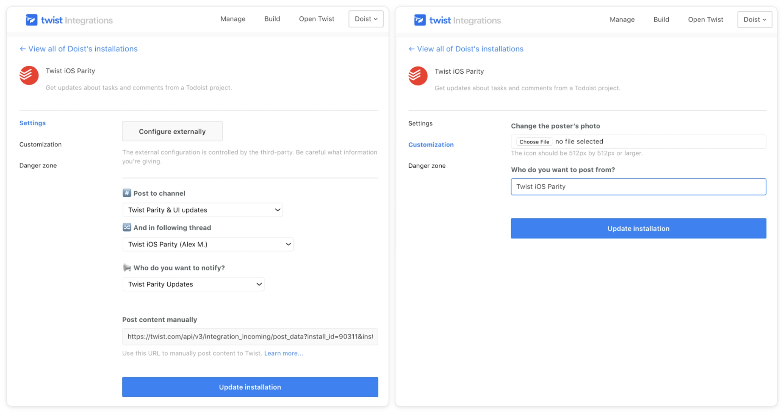
Here's how we filled out the fields to set up the integration:
Post to channel
Select the channel: Currently, for Twist we have a separate one, “Twist Parity & UI updates”. For Todoist we would recommend adding this thread integration to preexisting channels like “Todoist iOS”, “Todoist Android” etc.
And in following thread
Select: new thread
Who do you want to notify?
You can set up a separate group inside the channel that notifies only the people who need to be notified. After creating the group, select it in the integrations settings
Who do you want to post from?
The name of the poster should be the Todoist project. E.g.“Twist iOS Parity”.
This way, each thread is easy to identify.
Assemble Your Project Members
We try to keep our Todoist parity projects small. For instance, the “Twist Web Parity” project includes our Head of Front-end Development, Henning, our Head of Support, Malin, and myself.

- Product designer - Mainly responsible for finding parity problems, designing a solution, and assigning the implementation to a developer. Afterwards they review the implementation before it goes live. This role is often completed by our “Design Hero”. At Doist, a design hero is a designer or illustrator whose highest priority is to increase the quality of the apps and our designs, polishing details like icons, uncovering inconsistencies, finding and suggesting improvements, and fulfilling small requests from the team. This is a rotating month-long role.
- Platform developer - This developer is responsible for implementing a change on their specific platform (i.e. iOS or Windows).
- Support specialist - Someone from the support team is also included in the project so they can see upcoming changes to our products and communicate any significant changes to the rest of the support team and our users. For the most part, our support team member is simply observing the project and only interjects if something will negatively impact users.
Add Tasks to the Project
Designer’s responsibility
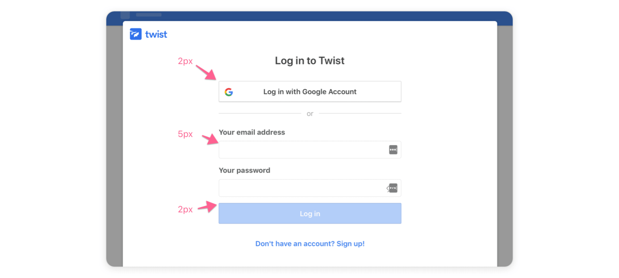
- Describe the task, add it to the parity project, add the platform as a label (e.g.“@web”), and assign it to the developer:
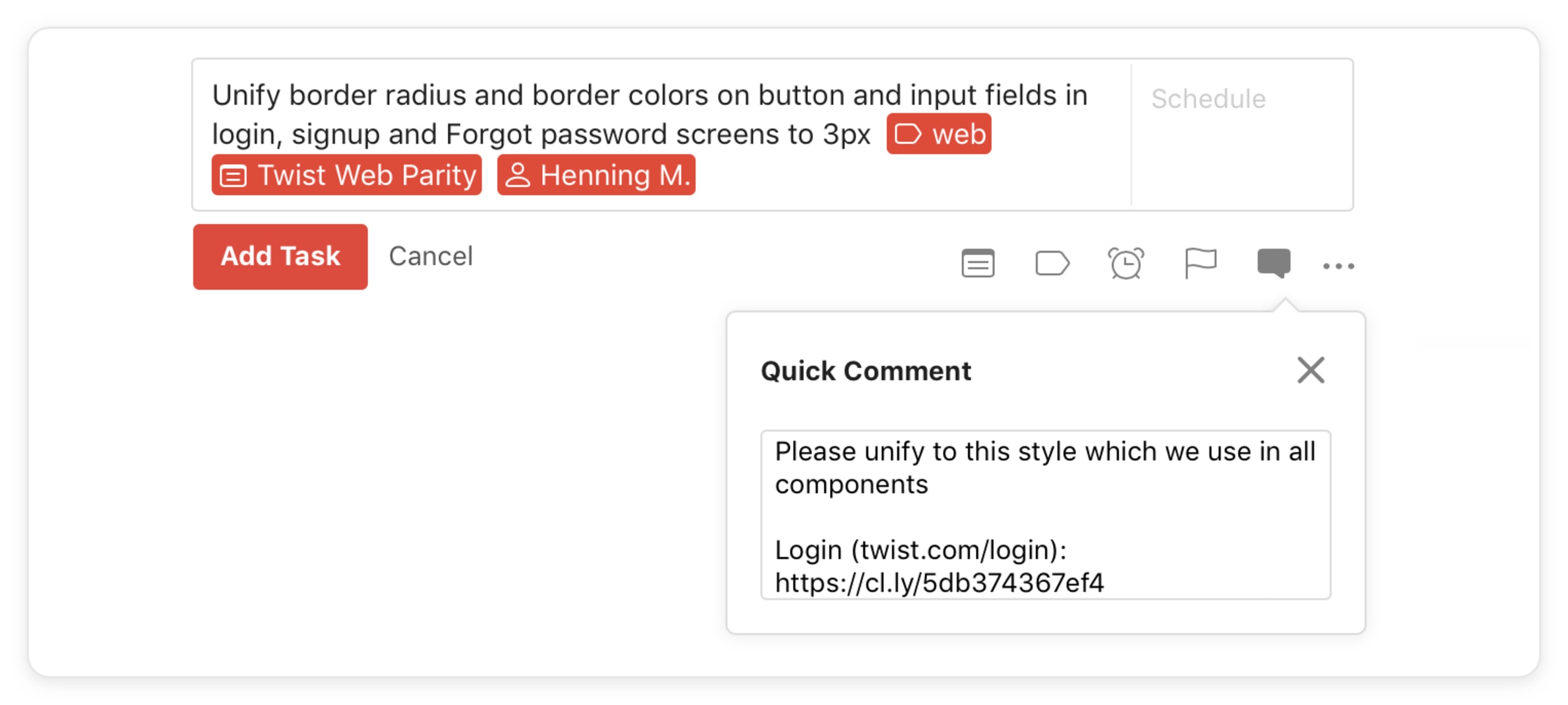
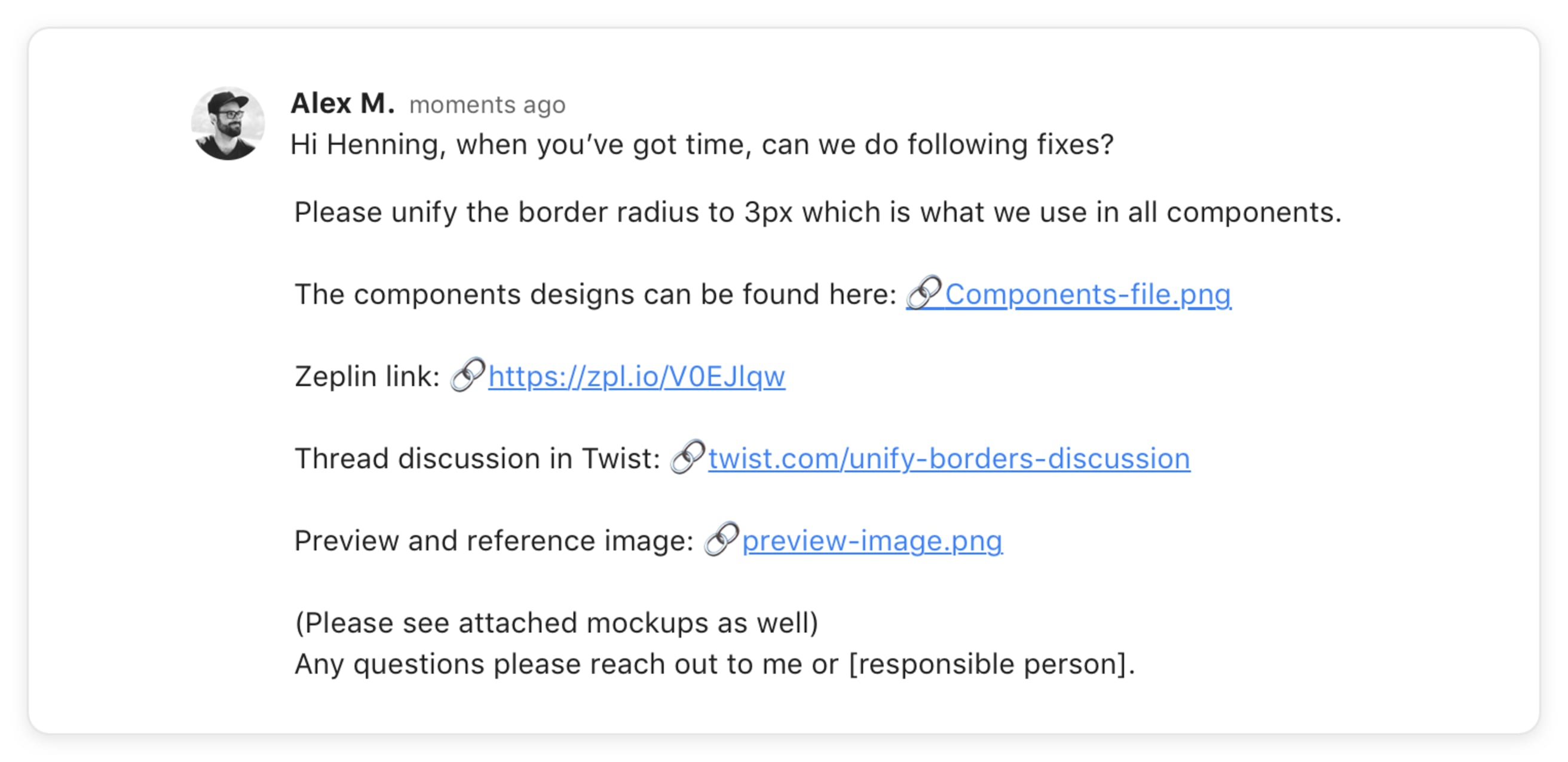
- Add visuals to the task comment - this includes annotated screenshots (with apps like CloudApp), mockups, links, and assets. Add as much information as possible to provide context for the developer. This is especially important on a remote team where each back-and-forth can create a lot of unnecessary delays.
The designer adds the reasoning behind the solution in a task comment, if applicable, so developers can communicate the change accurately in changelogs or discuss if needed. This is also a space to ask questions or seek clarification (e.g., Does this change affect other components as well? Is it just a bug?)
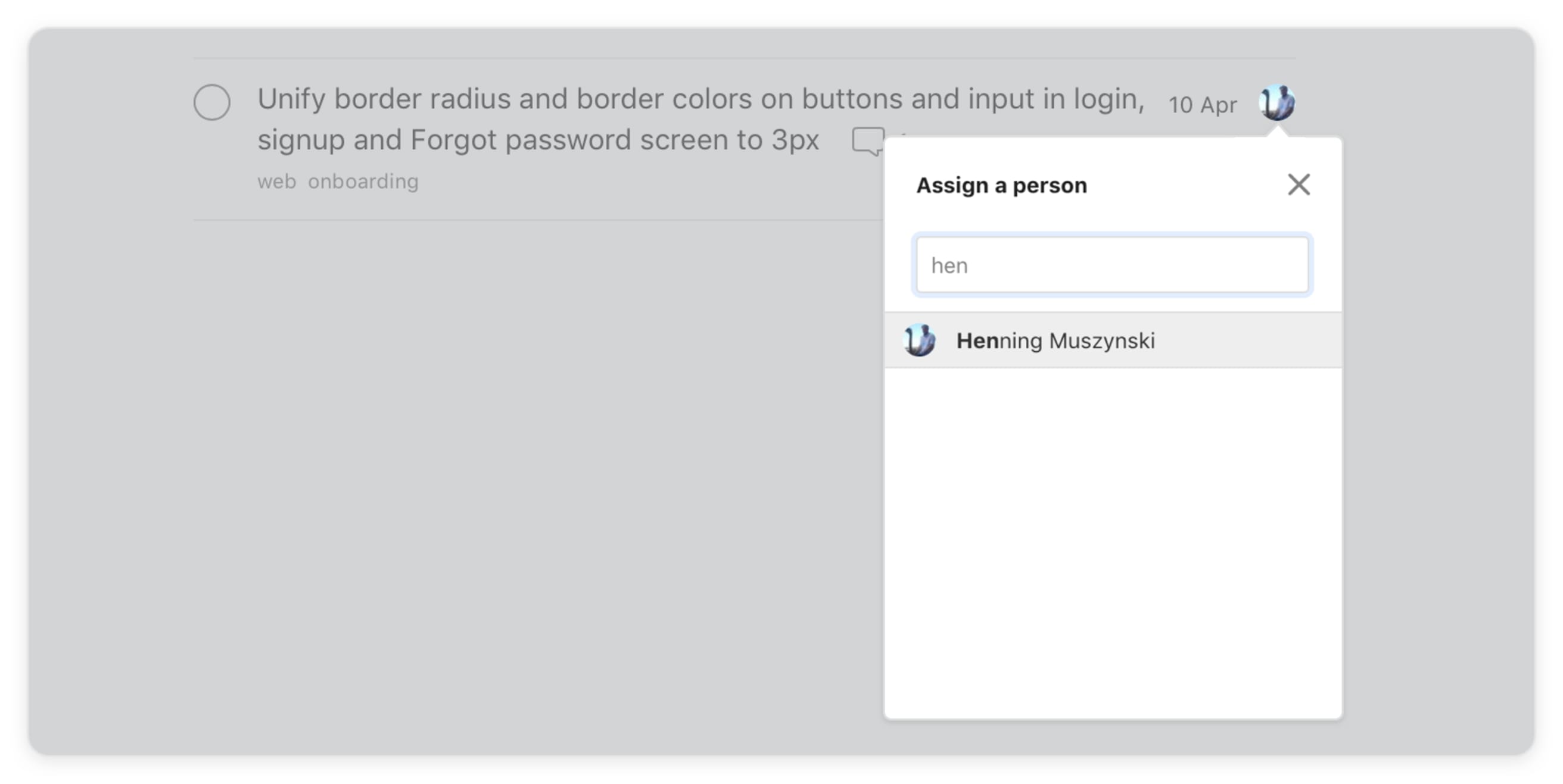
- Designer assigns the task to the developer and notifies them in the added comment.
Prioritize Tasks
Developer’s responsibility
Usually, developers work on the list of tasks from oldest to newest.
Each new task gets added to the bottom of the list. It’s the responsibility of the developer to evaluate the required effort or a rough time estimate for the task.
Most tasks are usually small fixes. If the change requires a significant amount of work, the developer flags it to the designer and platform Head (i.e. “Head of Android). We can discuss an intermediate solution or create a project proposal to address the fix more formally if needed.
If there’s a pressing product bug that impacts the daily experience of our users, a designer or someone on the product team can flag this situation to the platform developer. In this case, the task gets bumped up in the list with a higher priority.

If developers are unsure about prioritization it’s the duty of the designer to help them prioritize and reorder the list of implementation tasks. The developer needs to be vocal about situations where they're struggling with the workload.
Report Implementation Tasks as Complete
Developer’s responsibility
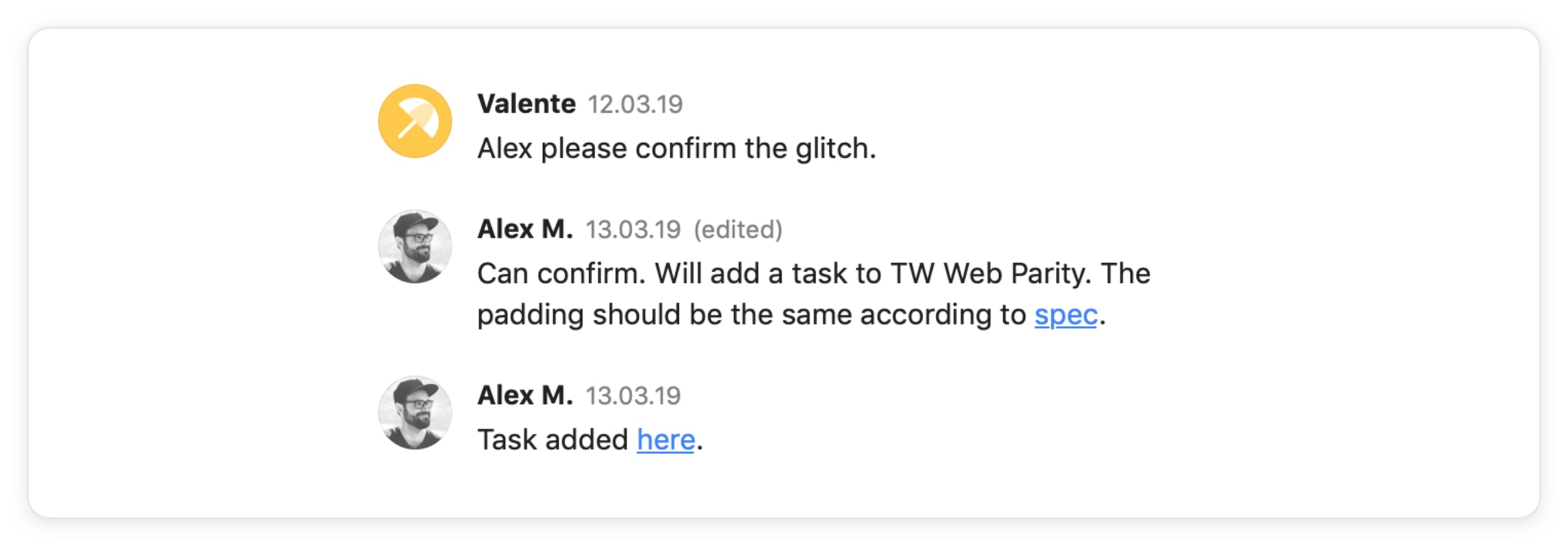
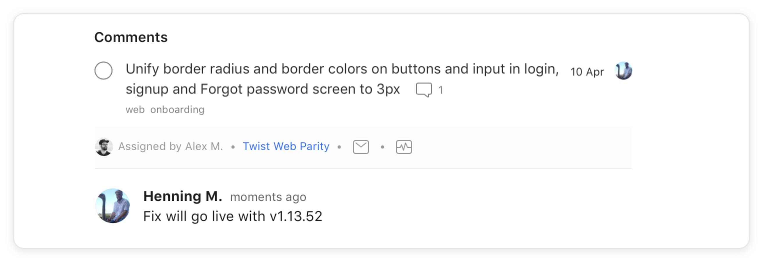
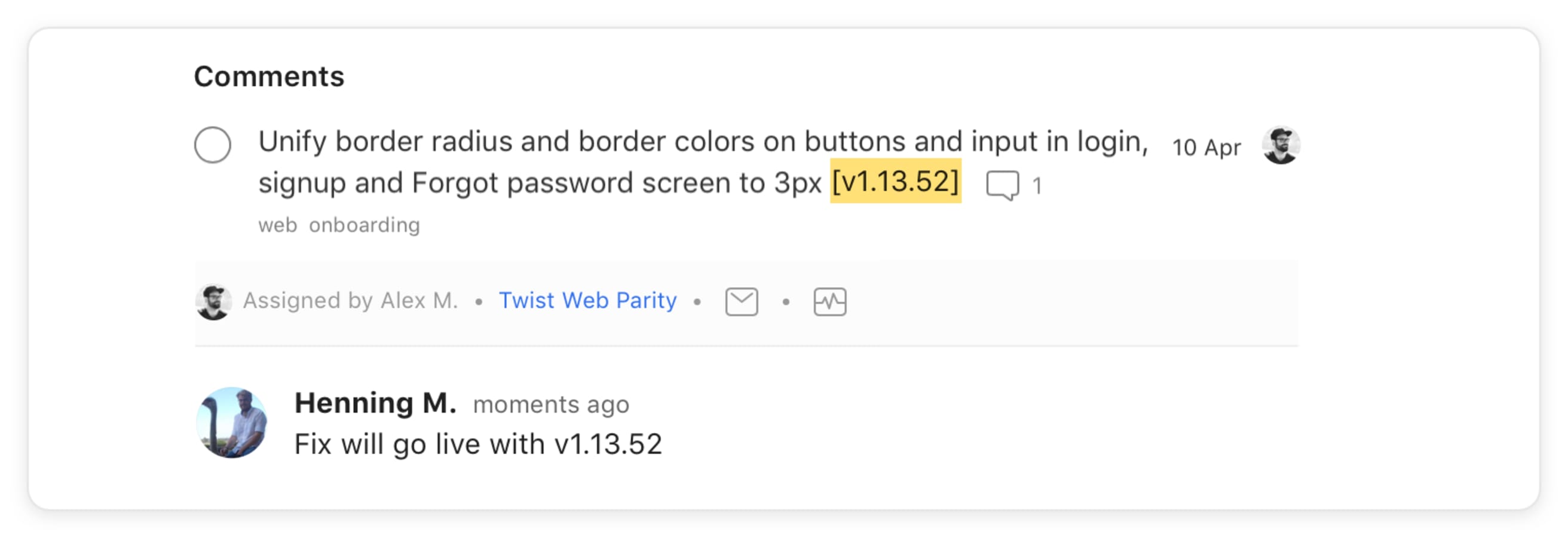
Once implementation is done, the developer informs the designer about it in the task comment:
Assign Task Back to the Designer
Developer’s responsibility
The task will then be assigned back to the designer

The task name will be changed by the developer to include the version number when the change is live. This way the designer knows when the change is available to review.
Move the Task to “Review”
Designer’s responsibility
Then, the designer moves the task to the Review section. This can be done by the developer, too, but it’s the designer’s responsibility to make sure all tasks are in their right place.

Review Task and Move to “Done”
Designer’s responsibility
The designer reviews and tests the changes in the live implementation or beta.
There are two scenarios to move forward:
- The implementation looks and works as intended → Task will be completed and moved to “Done” section. No further communication needed.
- The designer finds something to fix → Designer adds a new comment for the developer, uncompletes the tasks and reassigns the task to the developer again. → The developer makes further improvements and assigns the task to the designer again. The flow starts again until no further changes are needed.
Making small and consistent changes to your apps keeps design debt from piling up. These types of improvements don't usually fall neatly into a regular 4-6 week product cycle. If you don't have a clear design and development workflow for requesting and following up on the small things, it's easy for them to be deprioritized and forgotten. Instead, with the right workflow, they can be tackled in 1-5 days with a small and nimble team without detracting from higher-impact projects.
Of course, this workflow is a work in progress. For example, we're currently testing having developer and designer "heroes" focused solely on improvements and bug fixing during each monthly project cycle and others primarily working on new features or other bigger projects. I hope this peek into our process helps inspire other design and development teams to work together to set a high bar for quality not just for big features but for the small details too. Feel free to leave questions or feedback in the comments below!
